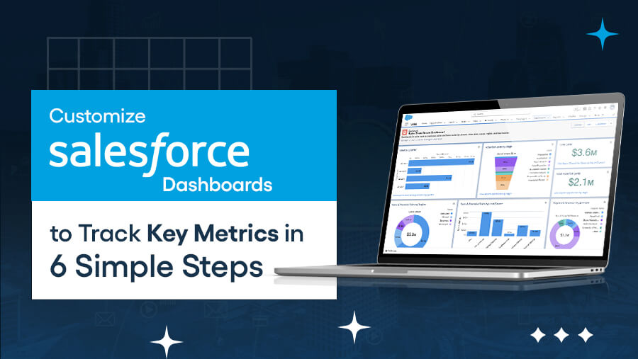
Customize Salesforce Dashboards to Track Key Metrics in 6 Simple Steps
Anisha

Have you ever opened your Salesforce dashboard and felt overwhelmed by irrelevant data or cluttered visuals?
This primarily happens when dashboards aren’t tailored to your unique needs. In fact, Salesforce dashboards are more than just a collection of charts—they’re powerful tools that bring your data to life, enabling you to make informed decisions.
However, customization is key to accessing their full potential. A well-designed dashboard ensures you focus on metrics that matter to your team and business goals.
In this guide, we’ll walk you through customizing your Salesforce dashboards. By the end, you’ll have a streamlined, personalized dashboard that provides clear insights and empowers your decision-making.
Why Must You Customize Your Salesforce Dashboard?
A well-customized Salesforce dashboard helps you track progress, identify trends, and make informed decisions. Here's why customization is essential:
The Challenges of Default Dashboards
Default dashboards in Salesforce come with limitations, such as:
- Irrelevant Data: Showing metrics that don’t apply to your business.
- Cluttered Layouts: Overloaded visuals make finding what you need hard.
- Limited Personalization: A one-size-fits-all approach that doesn’t cater to individual teams or roles.
Benefits of Custom Dashboards
Here’s how customization helps overcome generic dashboards’ limitations:

What Are the Key Metrics to Track on Your Salesforce Dashboard?
Custom dashboards allow you to track the metrics that matter most to your business. Below are some standard key metrics and why they are crucial:

Tracking these metrics regularly ensures your team stays informed and aligned, while a customized dashboard ensures the data is presented in a way that’s easy to understand and act upon.
Beyond aesthetics, customizing Salesforce equips your business with the tools to succeed. In the next section, we will explore how to do this.
How to Customize Your Salesforce Dashboard: 6-Step Guide

Here's a detailed step-by-step guide to help you create a dashboard that tracks key metrics effectively.
Step 1: Access Your Dashboard
Before customizing, you need to access the dashboard section in Salesforce. Here's how:
- Navigate to Dashboards: From your Salesforce home screen, click the App Launcher (grid icon) and search for Dashboards.
- Locate Existing Dashboards: You’ll see a list of available dashboards in folders. Use the search bar or filter options to find specific dashboards.
- Check Permissions: Ensure you have the necessary permissions to create or edit dashboards. Admin roles usually have full access, while other roles may require additional settings.
Pro Tip: Organize dashboards by team or function in folders for easy navigation (e.g., Sales Dashboards, Marketing Dashboards).
Step 2: Create a New Custom Dashboard
Building a new dashboard gives you full control over its design and functionality.
- Start a New Dashboard: Click New Dashboard and give it a meaningful name (e.g., “Sales Performance Overview”).
- Choose a Folder: Save the dashboard in the appropriate folder to make it accessible to the right users.
- Select a Layout: Salesforce offers multiple layout options. Choose one based on your data needs:
- Standard Layout: Good for a mix of charts and tables.
- Custom Layout: Perfect for dashboards with specific visual requirements.
- Pick a Template: Salesforce provides templates tailored for sales, service, or marketing. You can start with a template that aligns with your goals or build from scratch.
Pro Tip: Use a clean layout that prioritizes key metrics at the top for quick visibility.
Step 3: Add and Configure Components
Dashboard components are the building blocks of a great dashboard. Here’s how to make them work for you:
- Add Components: Click + Component to add widgets like charts, graphs, tables, or metrics.
- Configure Data: For each component, choose the report or data source. For example, select a “Sales Performance” report to populate a chart.
- Apply Filters: Use component filters to narrow down data, such as filtering by region, team, or time.
- Customize Appearance:
- Change chart types (e.g., bar, pie, line) to suit your data presentation.
- Adjust colors to differentiate data segments or reflect your branding.
- Group data (e.g., by product, territory) for better visualization.
Pro Tip: Use summary tables for detailed views and charts for quick overviews.
Step 4: Customize Data Sources
The accuracy of your dashboard depends on the quality and relevance of its data.
- Select Reports or Objects: Choose the most relevant report or Salesforce object when adding a component. For example:
- Use a “Pipeline Status” report for opportunity tracking.
- Select “Account Data” for customer insights.
- Apply Data Filters: Focus your dashboard by applying filters to show only active deals, current quarter performance, or specific territories.
- Update Reports: Ensure your dashboard's reports are up-to-date and include all relevant fields.
Pro Tip: Regularly audit your reports to remove outdated or irrelevant data.
Step 5: Set Up Dynamic Dashboards for Different Teams
Dynamic dashboards ensure each user sees only the data relevant to them without creating multiple dashboards.
- Enable Dynamic Dashboards: Set the dashboard to “Run as Logged-In User” in the dashboard properties.
- Assign Roles: Customize dashboard access by role or department (e.g., Sales Rep, Marketing Manager).
- Tailor Views: Use filters to personalize the data each user sees. For example:
- Sales reps can view only their opportunities.
- Marketing managers can focus on campaign performance.
Pro Tip: Limit the number of components on a dashboard to avoid overwhelming team members.
Step 6: Save and Share Your Custom Dashboard
Once your dashboard is complete, ensure it’s accessible to the right people.
- Save the Dashboard: Click Save & Run to finalize your custom dashboard.
- Set Permissions: Adjust sharing settings to allow specific users or teams to view or edit the dashboard.
- Share the Dashboard: Use the Share option to send a link or add the dashboard to relevant users’ home screens.
Pro Tip: Review permissions regularly to ensure sensitive data is only visible to authorized personnel.
Best Practices for Optimizing Salesforce Dashboards
To ensure your Salesforce dashboards are effective and impactful, follow these best practices:
1. Regularly Review and Update Dashboards
Your business priorities and key metrics evolve over time. Ensure your dashboards stay relevant by:
- Conducting a quarterly review to update components and data sources.
- Aligning dashboard metrics with current business goals (e.g., tracking new KPIs for a product launch).
- Removing outdated or unnecessary widgets to avoid clutter.
Pro Tip: Schedule reminders to review dashboards with your team regularly.
2. Keep It Simple
Overloading a dashboard with excessive data can overwhelm users. Simplify by:
- Focusing only on the most critical metrics (e.g., revenue, pipeline status, lead conversion rates).
- Limiting the number of components to avoid visual clutter.
- Grouping related metrics together (e.g., all sales metrics in one section).
Pro Tip: Use drill-down reports for detailed data instead of crowding the dashboard.
3. Organize the Layout for Easy Navigation
A well-structured dashboard saves time and enhances usability:
- Place high-priority metrics (e.g., sales performance) at the top for quick access.
- Use sections to group related components, such as sales, marketing, or customer service.
- Ensure consistency in layout across dashboards to make them intuitive for team members.
Pro Tip: Test your layout with users and adjust it based on their feedback.
4. Use Colors and Visual Elements Strategically
Visual design plays a crucial role in how information is interpreted:
- Apply colors to highlight trends, such as green for growth and red for areas needing attention.
- Choose appropriate chart types (e.g., bar charts for comparisons and pie charts for proportions).
- Avoid overusing colors that can confuse or distract users.
- Use icons and labels to make data points more intuitive.
Pro Tip: Stick to a consistent color scheme that aligns with your branding and team preferences.
Troubleshooting Common Issues in Salesforce Dashboards

By addressing these issues systematically, you can ensure your Salesforce dashboards remain reliable and effective for tracking key metrics. Let’s check this out in more detail:
1. Data Not Appearing Correctly
Issue: Dashboard components display incomplete or inaccurate data, leading to confusion or errors.
Solution:
- Verify Data Sources: Ensure reports and objects feeding the dashboard are correctly configured.
- Adjust Filters: Check that filters are applied correctly to include all relevant data.
- Refresh Components: Manually refresh dashboards if auto-refresh is disabled.
2. Permissions Issues
Issue: Users encounter restrictions when accessing certain dashboards or components.
Solution:
- Review Roles and Access Levels: Confirm users have the necessary dashboard folders and components permissions.
- Adjust Sharing Settings: Share dashboards with specific users, roles, or public groups as needed.
3. Components Not Updating as Expected
Issue: Certain widgets fail to display the latest data.
Solution:
- Enable Auto-Refresh: Activate auto-refresh settings for real-time updates.
- Check Report Status: Verify that underlying reports are updated and synced with the dashboard.
4. Slow Dashboard Performance
Issue: Dashboards take too long to load, impacting usability.
Solution:
- Optimize Reports: Simplify complex reports by reducing filters or grouping criteria.
- Limit Components: Use only essential components and avoid overloading the dashboard.
5. Incorrect Data Visualization
Issue: Graphs or charts fail to represent data accurately, leading to misinterpretation.
Solution:
- Reconfigure Charts: Choose the appropriate visualization type (e.g., bar, pie, line) for the data.
- Verify Data Types: Ensure data fields match the expected input for components.
6. Data Syncing Issues
Issue: Dashboards reflect incomplete or delayed data from integrated systems.
Solution:
- Check Integration Settings: Review sync configurations for platforms like Salesforce and third-party CRMs.
- Monitor Sync Frequency: Adjust syncing intervals to avoid delays.
7. Dashboard Layout Issues
Issue: Components are poorly organized, making the dashboard hard to navigate.
Solution:
- Reorganize Layout: Use a logical sequence to group related components together.
- Adjust Sizing: Resize widgets for better readability and alignment.
8. Missing Data in Reports
Issue: Reports linked to dashboards fail to capture all necessary information.
Solution:
- Review Filters: Ensure that report filters exclude no critical data.
- Expand Criteria: Broaden search parameters to include all relevant metrics.
Final Word
Customizing Salesforce dashboards is essential for turning raw data into actionable insights. By tailoring your dashboards to track key metrics, you empower your team to make smarter decisions, collaborate effectively, and stay aligned with business goals.
Follow the steps and best practices shared in this guide to create dashboards that are clear, efficient, and truly impactful. Start customizing your Salesforce dashboards today and take control of your data!
News Letter
Subscribe our newsletter to get our
latest update & news


